Market research glossary: NPS, CATI, U&A and 20 more terms - with formulas and examples
24 market research terms explained with real numbers: how to calculate NPS, CSAT, CSI and more.
There's a moment in every research meeting that everyone has lived through: someone says, "we should run a CATI wave, then dig deeper with a U&A study," everyone nods seriously - and at least a third of the room is quietly wondering whether that's actually the name of an Italian cookie brand.
It's not Italian. And it's not a cookie. We've collected every term that marketers, researchers, and CX specialists throw around as if it were as obvious as saying "hello." What follows is a no-snobbery breakdown: what each term means, how it's actually calculated with real numbers, and how to keep them straight in your next big meeting.
Metrics that measure loyalty and satisfaction
These are the numbers most customer experience reports are built around. Knowing not just their names but how they're actually calculated isn't a nice-to-have - it's a necessity, unless you enjoy defending a presentation where NPS and CSAT got swapped.
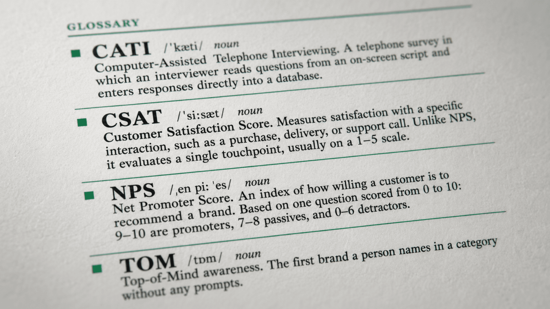
NPS (Net Promoter Score) measures how likely a customer is to recommend you to a friend. It comes from a single question - "How likely are you to recommend us?" - on a 0-to-10 scale. Respondents who answer 9-10 are promoters, 7-8 are passives, and 0-6 are detractors.
Worked example. You survey 100 customers. 45 of them score 9 or 10 - promoters (45%). 30 score 7 or 8 - passives, dropped from the calculation. 25 score 0 through 6 - detractors (25%). NPS = 45% − 25% = 20. The NPS calculation formula produces a result between - 100 (everyone's a detractor) and +100 (everyone's a promoter). Anything above zero is decent, above +50 is strong, and brands at Apple's level usually sit around +60 to +70.
CSAT (Customer Satisfaction Score) measures satisfaction with one specific interaction — a purchase, a support call, a delivery. Unlike NPS, which measures overall attitude toward the brand, CSAT is narrow: "How satisfied were you with today's visit?" - usually rated on a 1-to-5 scale.
Worked example. After a delivery, you survey 200 customers. "Satisfied" means a score of 4 or 5 - 150 customers land there. CSAT = (150 ÷ 200) × 100% = 75%. In most industries, a CSAT survey score of 75–80% or higher is considered good - though the more useful comparison is against your own trend over time, not an abstract benchmark.
CSI (Customer Satisfaction Index) is CSAT's heavier-weight relative. Instead of one question, it's a composite index built from several parameters, combined into a single number weighted by how much each one matters to the customer.
Worked example. Customers rate three parameters on a 10-point scale: quality (average score 8), price (6), and service speed (7). You've already set weights based on how much each one matters to your customers: quality 40%, price 30%, speed 30%. CSI = 8 × 0.4 + 6 × 0.3 + 7 × 0.3 = 3.2 + 1.8 + 2.1 = 7.1 out of 10. Those weights are exactly what separates the customer satisfaction index from a plain average: if price matters more than quality for your audience, swap the weights, and the final number shifts even though the underlying scores stayed the same.
CES (Customer Effort Score) measures how much effort a customer had to put in to get their issue resolved. The question usually reads: "How easy was it to resolve your issue?" on a scale from 1 (very difficult) to 7 (very easy).
Worked example. You survey 150 customers after a support interaction, and the average score on the 1–7 scale comes out to 5.4. That's CES = 5.4. A score above the midpoint (here, above 4) is generally considered healthy, while an average dropping below 4 signals that resolving issues has become too much of a hassle. CES often predicts customer churn more accurately than NPS: what frustrates people isn't bad service on its own - it's a difficult path to getting the problem solved.
How data actually gets collected: three acronyms that matter
CATI, CAWI, and CAPI aren't secret code - they're simply the physical channel through which a question reaches a respondent. The difference between them is the difference between a phone call, a link, and a real person standing at your door.
CATI (Computer-Assisted Telephone Interviewing) is a phone survey where an interviewer reads questions off a script on screen and answers go straight into the database.
Example: a bank wants to hear from cardholders over 60 about a new mobile app - part of that audience responds poorly to online surveys but happily picks up a call from a real person. CATI is more reliable here than CAWI, even though it costs more.
CAWI (Computer-Assisted Web Interviewing) is the online survey platform format everyone pictures when they hear the word "survey" - a link, a form, done.
Example: you need to quickly survey 2,000 email subscribers about a new feature - send the link, and within a couple of days you've collected all the responses without a single phone call. Cheap, fast, and scales to thousands of respondents at once.
CAPI (Computer-Assisted Personal Interviewing) is a face-to-face interview, just with a tablet instead of a paper form.
Example: a retailer is testing shopper reactions to a new product display - an interviewer with a tablet catches people right as they leave the store, while the impression is still fresh. It's the most expensive and slowest of the three methods, but it captures nuance and non-verbal reactions that neither a phone call nor a web form ever will.
A focus group is a moderated discussion with 6 to 10 people, where the point isn't statistics but live reactions and the back-and-forth between participants.
Example: before launching a new drink flavor, a company gathers eight people, shows them three packaging options, and listens to the arguments that surface - sometimes participants talk each other into changing their minds right there in the room, and that shift is valuable data too.
An in-depth interview (IDI) is a one-on-one conversation, an hour to ninety minutes, built around open-ended questions with the freedom to wander off-script if that's where the interesting stuff turns out to be.
Example: a company is losing enterprise customers six months into the relationship - a quantitative survey will only tell you "there's churn," while ten IDIs will reveal that the real issue isn't the product but the customer's own internal procurement process. The gold standard for understanding "why," once the quantitative data has already shown you "what."
An online panel / respondent panel is a pre-recruited, verified pool of people willing to take surveys in exchange for a reward.
Example: you need 300 women aged 25–40 from Almaty with above-average income instead of hunting for them from scratch, you simply set those filters on the respondent panel and get the exact segment within hours, not weeks.
An omnibus survey means renting space for your questions inside someone else's large questionnaire, shared with several other companies at once.
Example: you need to quickly ask one question about brand perception, but a standalone study isn't worth the budget - so you attach your question to an omnibus survey, where it sits mixed in with questions from five other companies about cosmetics and car loans.
Methodologies with names fancier than the idea itself
A U&A study (Usage & Attitude study) looks at how people actually use a product or category, and what they think while doing it.
Example: a usage and attitude study of the food delivery category won't ask "do you like our service" - it'll reveal that people mostly order on Thursday evenings after work, pick dishes by photo rather than description, and do it not because they're too lazy to cook but because they want variety. That opens up entirely different marketing angles than just "we deliver fast."
CustDev (Customer Development) is a series of customer development interviews with potential customers, run before or during product development to validate a product hypothesis before building it.
Example: a startup wants to add group subscriptions. Instead of sending it straight to engineering, the product manager runs 15 interviews with potential customers - and finds that 12 out of 15 have no intention of sharing a subscription with anyone. The feature gets shelved, saving two months of development.
The Kano model sorts product features into three buckets through Kano model analysis: "must-be" features (their absence infuriates, their presence isn't exciting - like brakes in a car), "performance" features (more is simply better - delivery speed), and "delighters" (nobody asked for them, but they create a wow effect).
Worked example: a Kano survey asks respondents two questions about a dark mode feature. Functional: "How would you feel if dark mode were added?" Dysfunctional: "How would you feel if it were NOT added?" If the answer to the first is "I like it" and to the second is "I'm neutral" - the feature lands in "delighter": nobody's upset without it, but everyone's happy with it. If the first answer is "I'm neutral" and the second is "I dislike it" - that's a "must-be" characteristic, like a login button that actually works: its absence is infuriating, its presence is simply expected.
Brand Health Tracking (BHT) is a recurring, repeated study of a brand's condition: awareness, loyalty, and perception relative to competitors.
Example: in March, unaided brand awareness (TOM) was 12%; by June, it had dropped to 9%. A one-off survey in June would only tell you "it's 9% now," with no way to know if that's good or bad. Ongoing brand health tracking would show that the decline started right after a competitor launched a major campaign turning a bare number into a concrete story you can actually act on.
Words that sound statistical but are really just careful bookkeeping
A representative sample is a group of respondents whose composition - gender, age, city, income mirrors the structure of the entire audience you're trying to draw conclusions about.
Example: surveying 50 of your friends is technically a sample, just not a representative one: they're probably all roughly your age, from the same city, and think a lot like you do so the result won't tell you anything meaningful about your actual customer base.
Quota sampling is how you engineer representativeness by hand.
Worked example: your product's real audience is 60% women and 40% men, with 30% of all customers aged 18-24, 45% aged 25-40, and 25% over 40. When you recruit a sample of 500 respondents, quotas lock in those exact same proportions: 300 women and 200 men, split across age groups in the same ratios. Skip the quotas, and you can easily end up with 80% women simply because they respond to surveys more readily - quietly skewing your entire result.
Margin of error is the range within which the real result might differ from what you measured.
Example: an NPS of 42% ± 3 means the true figure most likely sits somewhere between 39% and 45%. As a rough guide: a sample of 400 people typically carries a margin of error around ±5%, while a sample of 1,000 brings that down to roughly ±3%. Push the sample from 1,000 to 5,000, though, and the precision gain becomes nearly invisible - which is exactly why chasing a million respondents is pointless: it's just extra spend with no real accuracy payoff.
TOM (Top-of-Mind awareness) is the first brand a person names in a category, unprompted.
Example: asked "which banks do you know," 34% of respondents name the same bank first - so that bank's TOM is 34%. Its overall awareness ("have you heard of this bank") might be above 90%, but TOM specifically shows who comes to mind first when a decision has to be made fast, rather than after a long comparison of options.
Three terms people constantly mix up
One recurring headache: the difference between market research, social listening, and reputation management. Here's one example covering all three at once, so the distinction is easy to see.
Picture a coffee chain that suspects customers aren't happy with its new seasonal drink.
Market research - the chain forms its own hypothesis ("the new drink is too sweet") and runs a customer survey to test it. An active step with a specific question and a clear goal set in advance.
Social listening instead of asking directly, the chain tracks what people are already saying about the drink on social media and in reviews, without jumping into the conversation - passive monitoring of opinions that already exist.
Reputation management (ORM) - the chain doesn't just log negative mentions, it responds to them, offers unhappy customers compensation, and updates the drink's description on the website. Social listening is "hearing it"; ORM is "doing something about what you heard."
Why bother knowing all this when you can just open a platform
Honestly, memorizing all 24 terms isn't mandatory if you have a tool on hand that suggests the right methodology for the job and explains what a number in a report actually means, including exactly how it was calculated. That's how gro.now, an AI-powered online survey platform with its own respondent panel, is built: it collects data through any of the methods above (except, arguably, CAPI - we haven't yet taught a tablet-carrying interviewer to walk), and it delivers results and recommendations in plain language, so you're not stuck digging through a glossary every single time.
But next time someone in a meeting says, "we should run a CATI wave, then dig deeper with a U&A study" - you'll know exactly what that means, and how the numbers behind it actually get calculated.